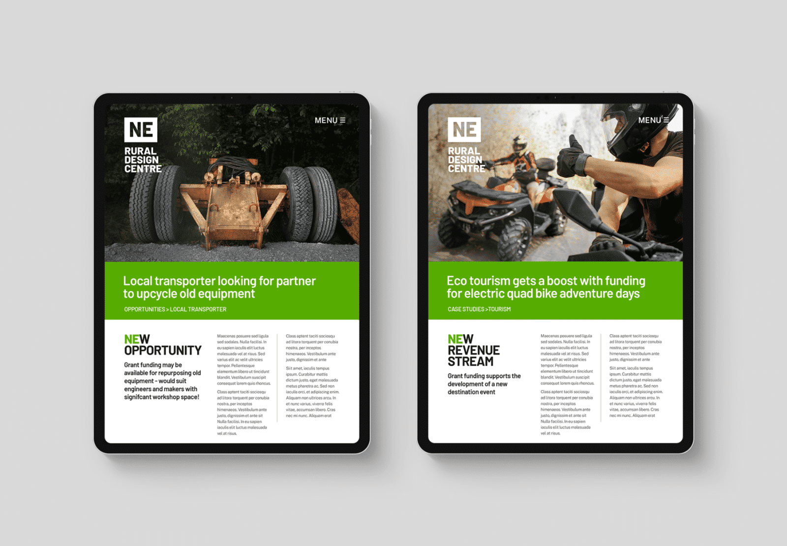
Branding for non-profits isn’t about being the best, it’s about being relevant. To us, this translated into region being the key when we pitched this new new brand identity.
Stakeholder and partner fit is a key consideration for anyone looking to launch a non-profit brand. While standing out can be key to commercial success, fitting in can be far more important here.
The ‘Rural Design Centre’ was the only brand name in its partner network that didn’t include a geographic indicator. Our proposal fixed the NE postcode into the logo – making the region a core component of the brand.
We then developed a sequence of brand purpose statements – phrases that would resonate with partners and potential clients but, most importantly, with the staff who will be championing the centre’s launch.


Our approach to non-profit branding
Non-profits and charities often talk about not wanting to look “too corporate” whilst more corporate briefs, by contrast, can focus on “future vision”. If there is time and budget, mood boards can be a useful way of exploring this difference and are a great kick off point for exploring things like the built environment.
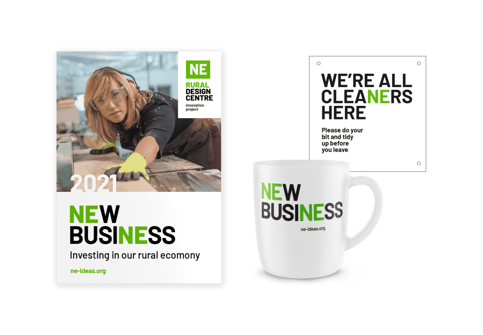
In practice, much of our initial work outside the corporate sector has a very practical focus. From very early concepts, we will be exploring what brand templates might look like, a variety of output, use of real life photography, building signage etc.
In style terms, it’s important designs don’t “look too expensive”, and so we will be constantly checking our approaches are appropriate. This is a linked to another big question – “is it deliverable?” As an agency, it’s important that we understand and accept that a big chunk of final output may well be produced in-house. So simple grids, consistent messaging and clear styling cues are vital if an approach is to succeed.
But while producing creative work in-house can have cost benefits, it can also lessen impact. Thinking just in terms of headlines, for example, there’s often a shift to “if” rather than “when”.
As we’re all risk averse compromises and caveats can start to creep in and what started out as clear and ambitious propositions is easily diluted.
This is one of reason we like to include promotional give aways in our early concepts. They can hold harder hitting and sometimes cheekier messaging. Clients often talk about them adding “personality”.
So, what you might not say on your homepage can be just right on a drinks coaster. This is helpful in a much broader sense because it provides another brand benchmark – as part of a set of early standards that future output can be judged against.
Results
The work we’ve shown here was part of our submission for a brand development project that was run via a tendering portal.
We didn’t win the contract but we’re still proud of the work. If you’re interested in hearing our views on the tendering process please click here to find out what we learnt.
Your View
Feel free to comment and let us know what you think. We’ve got many years of experience but we’re always learning – so please keep the feedback coming! If you want to ask us any questions please get in touch.
About us
Out of House is one of Cambridge’s leading brand and creative agencies. We work for clients across a wide range of sectors including non-profits, charities, corporates and start-ups. To see more examples of our work please click here.
0 Comments
Leave a comment